|
Posted: 9/5/2004 12:40:09 PM EDT
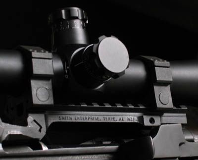
Shown here mounted on preban Bushmaster lower.
Destined for Stinger Arms lower currently residing in my safe adjacent to two Stripped DPMS units.  Bushmaster Patrolman's carbine Barrel (Bushmaster) YHM Forend (Denny's) Magpul XT rail panel's (Denny's) CMT upper (Denny's) USAF Matech Flip-up (Gun Broker) No label 6 Pos stock (Eagle Firearms) DPMS Side sling plate. (CMMG) Thanks guys. |
|
|
|
[#1]
I think it looks good, and the layout is much better than the typical "throw it on the floor" pic.
I like it. |
|
|
|
[#2]
Thanks! The detail on the rifle seems to just disappear though. What do you use for lighting?
I was just using the flash on my over priced digital camera. |
|
|
|
[#3]
The best lighting will always be natural lighting. However, direct sunlight will never make a picture look decent. Here are two pictures taken about 5 minutes apart. They are both garbage pictures, but look at the difference between direct sunlight, and 5 minutes later when the sun went behind clouds.   What this means is that we need to max things in our favor. If the second picture would have been composed decently, it would have been acceptable, but it wasn't because I was in a hurry. Because of this, I never bothered to upload these pics, they are simply poor. The difference in coloring, glare and shadow is massive when they are compared. |
|
|
|
|
[#4]
What GIVES, STICKMAN?
That appears to be a COLT SP1? I thought you were the ULITMATE ANTI COLT TROLL OF ALL TIMES? ROAR!! 
|
|
|
|
[#5]
Now that we've talked about a crappy pic, lets figure out what makes a picture halfway decent. I go with a few different things. The main item being shown, the lighting, and the layout of the picture. There are certainly other things that make it shine, but these are the most important. If we are missing any of them, the picture falls flat, and is simply yet more more jpeg cluttering up the web.
For the below picture, I used an old AR15 that was a beater, but that I rebuilt and refinished. The focal point of the picture was obviously the AR15, but how was I going to shoot it to make it look different than another "gun on the floor" picture? The subject matter was decent, but I need to work on layout. I decided that an American flag was highly appropriate, for what ends up as a police weapon. It also serves as a reminder to the officers that see the picture, that we "Serve". Nothing like subtle cues.... Anyway, I had the subject and background, now I needed to figure how I was going to blend them together. I shot a few different versions, but this always seemed to look best. If shot from much farther away, the weapon lost appeal and the picture had no definition, and up closer the flag lost its meaning. Lastly was the lighting. I shot this outside and used a makeshift stand to keep the flag off the ground. It was mid-afternoon, and I waited until I had solid cloud cover. The lighting was still a bit to heavy, and I was catching more glare in the picture than I wanted. I moved everything under some trees, which cut the lighting just right. Then I used fill-flash in the form of the camera flash, which brings out the detail in the weapon. Did it end up perfect? Nope, not even close, but I think it still does its job in standing out and not being "just another pic". 
|
|
|
|
[#6]
Nope, not even close to being the "Anti-Colt". I carry one every day, and it has served me well. As for the troll portion.....guilty as charged, my sole purpose on this site is to serve hate, discontent, and promote useless information Uggh uggh, insert random troll noises......  Now I'm off to get back under my bridge!! Now I'm off to get back under my bridge!!
|
|
|
|
|
[#7]
AFSOC,
Here is another failed picture where I went for a similar layout. This was shot inside for a few different reasons. Inside the garage, I opened the door and used ambiant light. I tried to use the camera flash to bring out detail, but it failed horribly. If we compare this picture against the one on the flag, we can see the similarities between content, and layout. It is quickly apparent that what this picture lacked was adequate lighting. I'll give myself a C- for effort, but not much higher marks than that. I should have known better, but figured I could pull it off anyway. It didn't work! It just goes to show that if any of the three key elements are missing, the picture just doesn't happen.  |
|
|
|
[#8]
Thanks for the tips!
I'll give it a try in a bit. |
|
|
|
[#9]
Well if that don't beat all. I thought you were Anti Colt. But you're just a DICK like ME! Nice pics, by the way. |
||
|
|
|
[#10]
Here is another picture I dug up.
This one was done by laying everything out on the bed. I adjusted the blinds until I had what I felt gave a good mood to the picture. I don't look at an AK as a "happy gun", so I went for a slightly darker picture. I had overhead lighting as well as the blinds directing light. I stood up on a chair, and zoomed in onto the AK and equipment, and used the flash. That little bit of flash from the camera (fill flash) is what makes the scratches on the bayonnet, the rust and blood on the LBV and other subtle items come to life in the picture. Without the fill flash being used, this picture looks very flat and is lacking in detail. As it turns out, I like this picture a lot. This pic is one of a series of this AKM. 
|
|
|
|
[#11]
First of all, I want to be the first to commend Stickman on the awsome picture above...As an amateur photographer myself I realize this is the type of results we strive for, personally, I am not an "AK guy" but this pic will make its way to my screen saver in short order.
I spoke with stickman, and he has agreed to critique a few "non-AR" photos for my education as well as anyone else who is interested. In the case of the two rifles, it is obvious the design I was after, but the results fell short of what I had desired. *edited down to one pic, for allocated data transfer problems* Stab away Stick....I asked for it. ~Crpdeth  |
|
|
|
[#12]
I like where you were going with this one, but I think it falls flat on a couple levels. The primary focus of the picture seems to be the mesh wrap. Obviously it is supposed to be the rifle, but the initial focal point of the picture is still the mesh. I think a good way to change this would be to get rid of the wooden background (too much contrast), and have only the mesh available as viewable background. I think the idea of keeping the rifle off center is great, but perhaps a bit less so.
The knife is never going to photograph well with that blade, so I would probably pull that out of the picture. The lighting is still problematic in that picture. The fill flash also seems to be overpowering things, this can be adjusted by shooting from farther away (usually getting up higher), or by putting a piece of tracing paper over the flash section. Bounce flash can also be used, but usually only if you have a moveable seperate flash head. I would use more sunlight/ natural light for that layout, moving the setup closer to a window might be an option, or shooting at a different time of the day. Lastly, for something different, lets change your layout. Zoom in a little more, open the action halfway, and suddenly the focal point of the picture is the chamber. Subtle, but effective.
|
|
|
|
[#13]
Ok, I ran out and shot a picture of my FAL to give you an idea of what I meant. I don't have a nice long bolt to throw open on the FAL, so there is nothing to draw a line to our view point, but this is a little closer to what I meant (just a bastardized FAL version). I guess in this picture the magazine works well as an arrow to the focal point of the picture.

|
|
|
|
[#14]
Some great firearms photography and pro-2nd Amendment messages.................
Link to "A Human Right".......................(A GREAT Bookmark)  
|
|
|
|
[#15]
He does very nice work. I'm just trying to stop the "gun on the floor" pictures, and give some idea of how to do it....
|
|
|
|
[#16]
Thank you Stick, I think you are right on the money, I set the shot back up and tried a few more...My SLR is not digital and I have half a roll left, so it'll be a bit on that.
Meanwhile critique the 25-05 and the .38 if you have time. (removed those pics for the moment) Thanks alot Brother. ~Crpdeth |
|
|
|
[#17]
Those are good looking pics Stickman.
I’ve been trying to do the Ichiro Nagata thing too (I’ve got a long ways to go) a few different pics that have come out OK  SBRs on some packaging paper with only ambient light coming through the window  arf FSB, only ambient light and black construction paper off in the distance as a background 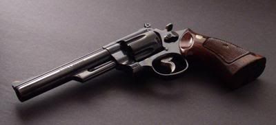 S&W Model 29  the set up for the last pic, all done with artificial light |
|
|
|
[#18]
 This is another one where the weapon was four feet away from the black construction paper that is being used as a background. Also just using ambient daylight and no flash. |
|
|
|
[#19]
..
|
|
|
|
[#20]
That's a sexy looking red X you have there...
|
|
|
|
[#21]
Hmmmm, I didn't realize this would be a problem, it seems that each time this thread is accessed my lil 'ol free website counts it towards it's allocated data transfer, once the limit is reached were left with pretty red X's
Grrrrrrrr ~Crp |
|
|
|
[#22]
Very nice use of light!! |
|
|
|
|
[#23]
Hope you approve of my new background.
No ambient available at the time so I used fill flash 
|
|
|
|
[#24]
I'm woking on the photo skills, Stick. Here's my first feeble attempt at it:
Edited to add: A more complete background seems to make alot difference - that's all I had for now - and a mag in the magwell makes all the difference in the world for a better looking pic. |
|
|
|
[#25]
Looks great Mongo!
I might try a similar Background if you don't mind my using it! |
|
|
|
[#26]
It's a long way from MO to MI, but you're welcome to use it, but you gotta come and get it yourself.
|
|
|
|
[#27]
I think I will use my own.......
Should work just as good..... Thanks anyway man! |
|
|
|
[#28]
.
|
|
|
|
[#29]
Okay Stick homework completed... I know I get point taken off already because I failed to open the action halfway, I agree that this was a great idea to gain a focal point I suppose I just had too much on my mind and simply cracked the bolt open, as you can see. As stated I still use and old SLR so naturally I burned up some more film, those pics will follow for general critiquing.  |
|
|
|
|
[#30]
.

|
|
|
|
[#31]
.

|
|
|
|
[#32]
.

|
|
|
|
[#33]
.

|
|
|
|
[#34]
.

|
|
|
|
[#35]
Where's the pics? All I see is dots...
|
|
|
|
[#36]
I think some of you aren't getting decent pics because you need a better camera. I don't really know anything about photography, but it just seams some of the pics aren't very clear or have a weird color to them. Just my .02
|
|
|
|
[#37]
I like it alot, if you are open to trying new things, check out different backgrounds. When I was shooting this pic series, I used several different backgrounds (mainly different uniforms & patterns), but found that this one pulled off what I was looking for much better than the others. I think the desert uniforms are a great background, and your second pic is certainly the favorite out of that group for me, with the first one being very nice as well. Nice, even lighting, but the positioning of the boonie hat makes me wonder if it shouldn't have been somewhere else.... I also think that if you folded the arms of the shirt out, instead of in, your background would have been a tad more complete, but that is a total judgement call on your part. 
|
|
|
|
|
[#38]
Still dont see them? Hunt 101 hosted them, I see them fine, of course that is probabally due to the fact that they are also stored on my hard drive. Lemme know a better place that will host them if you guys still cant see 'em. ~Crpdeth |
|
|
|
|
[#39]
I like it a lot, but our flag makes me partial. If you shot that without any additional lighting, I think it turned out as good as you could hope for, and maybe even better than it should have. I think the size of the pic is kind of small, as our flag has a lot going on within it. Pulling the weapon down 5 inches to its 7 o'clock might have filled it out a bit, but its a hard call. Either way, it has a nice clean look to the pic. |
|
|
|
|
[#40]
It was an overcast day, like you recommend, so I got a handle on the lighting thing. FYI, I laid the shirt back facing out because I though maybe the buttons and such would detract from the pic and folded the sleeves in so that the flag would show. The boonie had ended up there for now particular reason, but I figured the ranks insignia would add to the pic some. With the newly acquired info and knowledge, I'll start turning out some more pics soon. The help is appreciated.
|
|
|
|
[#41]
Outstanding layout, I really think the leaves make the picture into a seriously good layout. That is the good news. Like you pointed out, the bolt being unlocked, but still thrown shut, is going to kill the pic. The angle of the weapon is a good start, because it isn't straight across, but I would still pull it up or down a little more. It is a large enough object where it still tends to cut the pic in half, the only way to really avoid that is to alter your angle, and make sure you keep it out of dead center. Your camera is killing you right now. Film into digital is just a hard deal, but I'll tell you a story to make you feel better. I had a incredible shot of the Delaware water gap a long time ago, the layout was perfect, the lighting was perfect, and as I got out of my jeep to get the pic, I found a perfect foreground to lead into the picure. This was going to be a cover shot, as there was a purplish sunset on a fresh snow fall, and everything was textbook perfect. I made sure my shot was steady, my depth of field walked the viewer into the picture, and the exposure made the end result leap off the slide film it was taken on! Everything was perfect, with one small exception. I had been carrying a older beater lense, and the quality of the glass wasn't up to par with the picture itself. I learned a valuable lesson, no matter how good your subject is, its the end result that still matters. Sooner or later, you are going to need to go digital, it will end up being cheaper for you in the long run. |
|
|
|
[#42]
Nice layout, but it might have been worth pulling the sling off for this pic. The main thing wrong with this picture (leaving your camera out of it) is the lighting balance. The stock looks white, as do part of the binoculars and material in the upper and left section of the picture. I like the placement of the magazines, it adds something extra, without over powering the picture. |
|
|
|
[#43]
Yes, yes, yes. With a good camera, I think this would be a total winner. Sadly, it isn't a decent print to screen conversion.... |
|
|
|
[#44]
Ummmm, no. Lighting, glare, layout is too busy, holster webbing looks like an attack snake,and the knife is following the same plane as the slide of the weapon. |
|
|
|
[#45]
Yes, yes, yes!! Everything that is so very wrong in the above picture, is so very perfect in this one!! Biggest problem with this pic is the translation from print. |
|
|
|
[#46]
The straight across line in the pic kills any possibility it could have had. It also seems pretty busy, with too much going on. Glare is going to be hard to beat with the stock and scope, but it needs something done to it. The thin portion of the sling looks like an extension cord running though your picture. |
|
|
|
[#47]
I agree about the camera Stick, and I will be moving up to a digital, but I dont want second rate stuff If I'm going to be using it, and so many things are taking priority right now.
Thanks for the lessons, I'll be referring back as we go along. Just thought I'd mention, in the pic of the DPMS, the stock is a very light color (at least it was in the pic untill I worked on it some more) also the Steiners do have white lettering. Heres a close up of the stock....  I'll throw in another view of the DPMS...I didn't like/include this one because the stock is completly washed out, maybe with some darker colors added it will harden it up. In this one I did remember to utilize the open chamber idea, I also liked how the ammo look really crisp, unfortunatly a few mistakes is all it took to qualify this "potential desktop" for file 13 as well.  Trial and error...Always fun in this field. ~Crpdeth |
|
|
|
[#48]
Alright I will try again, I like the layouts you typically use with some other gear I may give that a try The pic is actually much larger I was just trying to make it more net friendly... I use a rather high res on the camera. I will see what I have around for a background.... |
||
|
|
|
[#49]
Hey, AFSOC, try www.tinypic.com. Those huge pics I post come from tinypic. I think that's rather funny.
|
|
|
|
[#50]
No real worries I was meaning out of deference to others, thos ewith Dialup choke on big pics.....
 Now this one I think is way too busy the composition is all wrong Lighting is too strong....... the pic looks lifeless which is the opposite of what I was trying to do... I will recompose this and try again.... |
|
|
 Win a FREE Membership!
Sign up for the ARFCOM weekly newsletter and be entered to win a free ARFCOM membership. One new winner* is announced every week!
You will receive an email every Friday morning featuring the latest chatter from the hottest topics, breaking news surrounding legislation, as well as exclusive deals only available to ARFCOM email subscribers.

AR15.COM is the world's largest firearm community and is a gathering place for firearm enthusiasts of all types.
From hunters and military members, to competition shooters and general firearm enthusiasts, we welcome anyone who values and respects the way of the firearm.

Subscribe to our monthly Newsletter to receive firearm news, product discounts from your favorite Industry Partners, and more.
Copyright © 1996-2024 AR15.COM LLC. All Rights Reserved.
Any use of this content without express written consent is prohibited.
AR15.Com reserves the right to overwrite or replace any affiliate, commercial, or monetizable links, posted by users, with our own.


