|
|
|
Jack Burton: This is gonna take crackerjack timing, Wang.
|
|
|
|
|
|
Originally Posted By IFBBjuicemonkey:
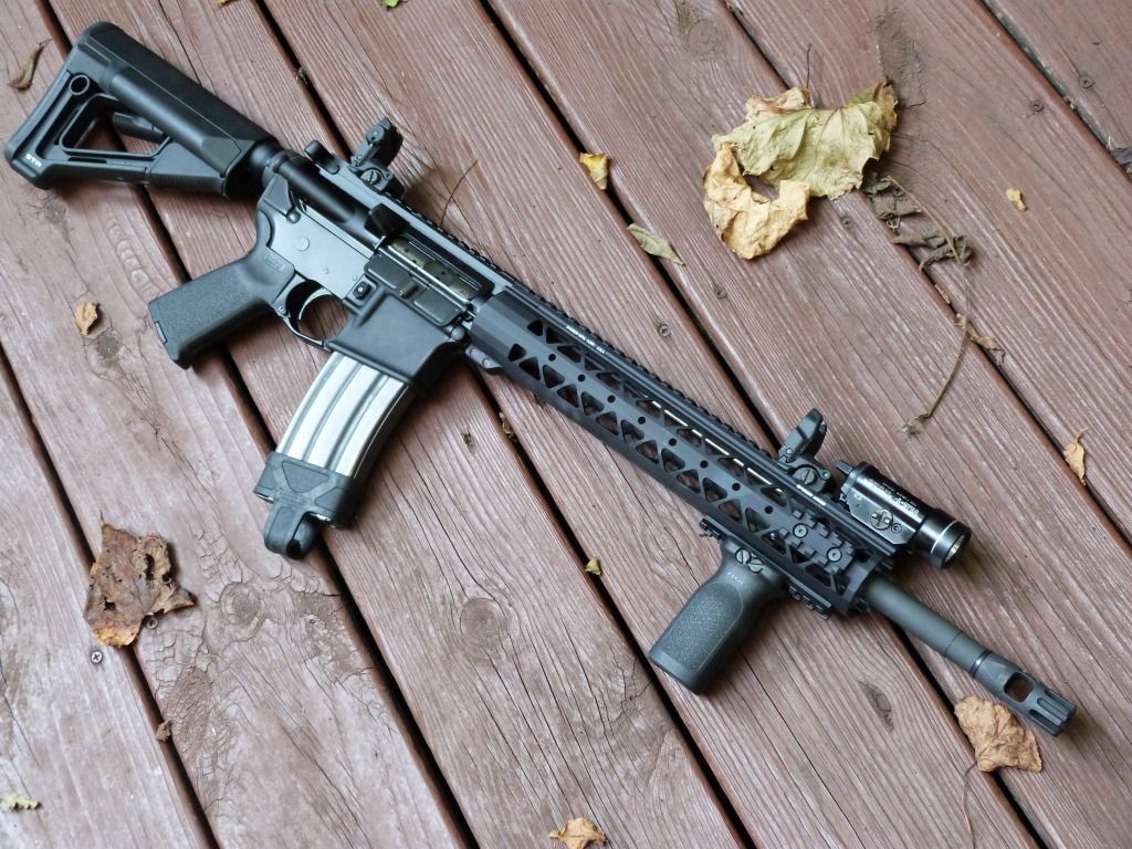
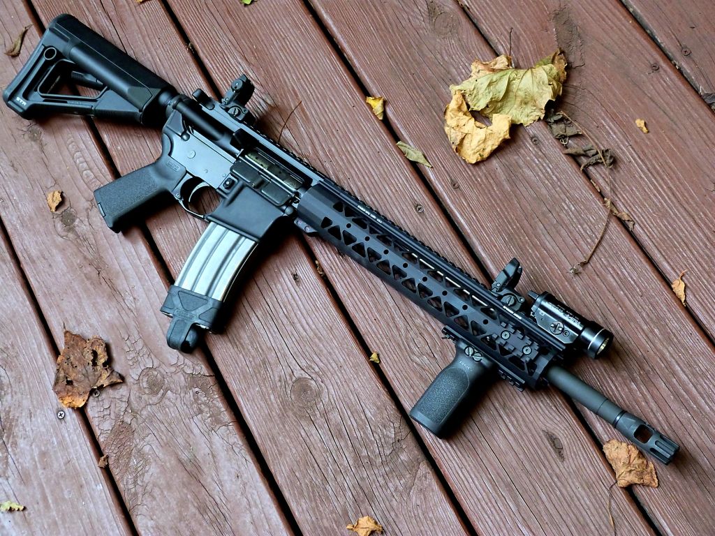
My VERY humble offerings to this thread http://www.freeimagehosting.net/newuploads/nbo6l.jpg http://www.freeimagehosting.net/newuploads/y4iii.jpg http://www.freeimagehosting.net/newuploads/p7fra.jpg http://www.freeimagehosting.net/newuploads/ont3f.jpg How do you activate the light? seems like the pressure pad is behind the VG? |
|
|
The opinions expressed are my own and do not necessarily reflect the views of my
employer. |
|
Stamp collector.
Want to buy: -Slickside carrier for a 604 receiver |
|
Happy thoughts.
|
|
|
|
"I believe in Christianity as I believe that the sun has risen: not only because I see it, but because by it I see everything else."
-C.S. Lewis |
|
Originally Posted By Bizzarolibe:
My first attempt at some decent photography (just got a decent camera––a Panasonic Lumix FZ-47k). Feel free to critique my skillz 
http://i40.photobucket.com/albums/e236/Snarky15/AR1510.jpg http://i40.photobucket.com/albums/e236/Snarky15/AR157.jpg http://i40.photobucket.com/albums/e236/Snarky15/AR1517.jpg http://i40.photobucket.com/albums/e236/Snarky15/AR1512.jpg http://i40.photobucket.com/albums/e236/Snarky15/AR1514.jpg http://i40.photobucket.com/albums/e236/Snarky15/AR1513.jpg Uncle Ted, is that you? Nice looking rifles! |
|
|
|
|
Originally Posted By gee223:
Originally Posted By Bizzarolibe:
My first attempt at some decent photography (just got a decent camera––a Panasonic Lumix FZ-47k). Feel free to critique my skillz 
http://i40.photobucket.com/albums/e236/Snarky15/AR1510.jpg http://i40.photobucket.com/albums/e236/Snarky15/AR157.jpg http://i40.photobucket.com/albums/e236/Snarky15/AR1517.jpg http://i40.photobucket.com/albums/e236/Snarky15/AR1512.jpg http://i40.photobucket.com/albums/e236/Snarky15/AR1514.jpg http://i40.photobucket.com/albums/e236/Snarky15/AR1513.jpg Uncle Ted, is that you? Nice looking rifles! I'm not quite sure I get it...who's "uncle Ted"?? |
|
|
"I believe in Christianity as I believe that the sun has risen: not only because I see it, but because by it I see everything else."
-C.S. Lewis |
|
Ted nugent. Highly known for his zebra striped weapons!
|
|
|
"Slow is smooth, smooth is fast!"
|
|
Originally Posted By sgwlower:
Ted nugent. Highly known for his zebra striped weapons! Wow. That he is, that he is... |
|
|
"I believe in Christianity as I believe that the sun has risen: not only because I see it, but because by it I see everything else."
-C.S. Lewis |
|
WARNING MY GRAMMAR SUCK MY SPELLING SUCK
Justin Beeber didn't father her baby...System Message did. He climbin' in your windows, snatchin' your people up... |
|
|
|
|
|
Originally Posted By Bizzarolibe:
My first attempt at some decent photography (just got a decent camera––a Panasonic Lumix FZ-47k). Feel free to critique my skillz 
http://i40.photobucket.com/albums/e236/Snarky15/AR1510.jpg http://i40.photobucket.com/albums/e236/Snarky15/AR157.jpg http://i40.photobucket.com/albums/e236/Snarky15/AR1519.jpg http://i40.photobucket.com/albums/e236/Snarky15/AR1512.jpg http://i40.photobucket.com/albums/e236/Snarky15/AR1514.jpg http://i40.photobucket.com/albums/e236/Snarky15/AR1513.jpg Not that I'm an expert. I have taken a photography class or two though. I think your doing awesome. The only thing I'd suggest is image layout stuff. Only the first in your set needs help if you ask me. The lines and focus points of the image should "normally" try and help the eyes attract to what your trying to portray. Normally people like the focus and the attention of an image to play around in the middle. Though its not a rule or standard. If its not given any attention then the whole thing can be missing something. The first image looks great, But the attention i kinda off. Its hard to focus on any one rifle. You've got two AR's in the shot which are both placed near the edges of the image. Neither AR is in a position that is pleasing to the eye. The viewer wants to either see one AR, part of one AR, or both AR's in full. Here are some examples I just whipped up. Here is an image, but this shot isn't that great. It needs some cropping. The bottom of the gun isn't exposed, and the barrel points off in the distance. Lots of this gun in the image needs to be cropped so the viewer can see more less, or more of the rifle needs to be exposed. 
Here is the solution to the image above. 
And here is the same image with work done to it. 
Here is another, The front of the rifle is too covered up in contrast to how much is visible to the back of the rifle 
Here is my solution I just whipped up: 
Here's another example. 
And a quick solution: 
Again. I didn't spend a ton of time on these. This is mainly to illustrate a helpful point. hopefully this helps. I loved your set though. Great looking shots. The first one is just a bit off IMO. But if you wanted the viewer to feel a sense of wanting more from both AR's, then you nailed it with the first image. |
|
|
|
|
|
|
Originally Posted By M4builder:
Just 3 for now. have MANY more. http://i192.photobucket.com/albums/z96/M4builder/ARFCOM/Picture006.jpg I really like this one! I have been looking at doing something similar to my rifle. Right now it is stock, but I wanted to add a nice quad and pistol grip, but leave the carrying handle. I prolly wont do a foregrip, but of all the picture threads I have seen, this is the only one I have seen that is similar to how I will do mine when I decide to actually get the stuff for it. It will do factory for now, but I can't wait until it looks more like that one |
|
|
|
|
WARNING MY GRAMMAR SUCK MY SPELLING SUCK
Justin Beeber didn't father her baby...System Message did. He climbin' in your windows, snatchin' your people up... |
|
|
|
Originally Posted By Munition:
Originally Posted By Bizzarolibe:
My first attempt at some decent photography (just got a decent camera––a Panasonic Lumix FZ-47k). Feel free to critique my skillz 
http://i40.photobucket.com/albums/e236/Snarky15/AR1510.jpg http://i40.photobucket.com/albums/e236/Snarky15/AR157.jpg http://i40.photobucket.com/albums/e236/Snarky15/AR1519.jpg http://i40.photobucket.com/albums/e236/Snarky15/AR1512.jpg http://i40.photobucket.com/albums/e236/Snarky15/AR1514.jpg http://i40.photobucket.com/albums/e236/Snarky15/AR1513.jpg Not that I'm an expert. I have taken a photography class or two though. I think your doing awesome. The only thing I'd suggest is image layout stuff. Only the first in your set needs help if you ask me. The lines and focus points of the image should "normally" try and help the eyes attract to what your trying to portray. Normally people like the focus and the attention of an image to play around in the middle. Though its not a rule or standard. If its not given any attention then the whole thing can be missing something. The first image looks great, But the attention i kinda off. Its hard to focus on any one rifle. You've got two AR's in the shot which are both placed near the edges of the image. Neither AR is in a position that is pleasing to the eye. The viewer wants to either see one AR, part of one AR, or both AR's in full. Here are some examples I just whipped up. Here is an image, but this shot isn't that great. It needs some cropping. The bottom of the gun isn't exposed, and the barrel points off in the distance. Lots of this gun in the image needs to be cropped so the viewer can see more less, or more of the rifle needs to be exposed. http://farm8.staticflickr.com/7265/7741220478_9d4f7a9279_k.jpg Here is the solution to the image above. http://farm9.staticflickr.com/8281/7741227390_9f769590fe_k.jpg And here is the same image with work done to it. http://farm8.staticflickr.com/7062/6945199465_905e653f58_h.jpg Here is another, The front of the rifle is too covered up in contrast to how much is visible to the back of the rifle http://farm9.staticflickr.com/8286/7741224566_b016572e20_k.jpg Here is my solution I just whipped up: http://farm9.staticflickr.com/8296/7741225068_bff9677d1e_h.jpg Here's another example. http://farm8.staticflickr.com/7260/7741222648_47220b6959_k.jpg And a quick solution: http://farm9.staticflickr.com/8444/7741225530_dad4970189_h.jpg Again. I didn't spend a ton of time on these. This is mainly to illustrate a helpful point. hopefully this helps. I loved your set though. Great looking shots. The first one is just a bit off IMO. But if you wanted the viewer to feel a sense of wanting more from both AR's, then you nailed it with the first image. Thanks alot for the advice. Exactly what I wanted. Just so you know, the first shot was meant to be a bit abstract, but yeah, it doesn't quite work does it? Also, what effects do you use, aside from the graphics effects (e.g., frames, black and white, etc.)? My big three are: 1) increased hue saturation 2) increased contrast (and usually a decrease in brightness), and 3) a small dose of unsharp mask. I use Gimp. Are there any more "mainstay" effects I should be aware of? Here is one of my before and afters: Before: 
After: 
|
|
|
"I believe in Christianity as I believe that the sun has risen: not only because I see it, but because by it I see everything else."
-C.S. Lewis |
|
|
|
Native Maryland man amassing an arsenal in Wyoming
|
|
|
Blessed are the Peacemakers, for they shall be called Sons of God
|
|
Originally Posted By Bizzarolibe:
Originally Posted By Munition:
Originally Posted By Bizzarolibe:
My first attempt at some decent photography (just got a decent camera––a Panasonic Lumix FZ-47k). Feel free to critique my skillz 
http://i40.photobucket.com/albums/e236/Snarky15/AR1510.jpg http://i40.photobucket.com/albums/e236/Snarky15/AR157.jpg http://i40.photobucket.com/albums/e236/Snarky15/AR1519.jpg http://i40.photobucket.com/albums/e236/Snarky15/AR1512.jpg http://i40.photobucket.com/albums/e236/Snarky15/AR1514.jpg http://i40.photobucket.com/albums/e236/Snarky15/AR1513.jpg Not that I'm an expert. I have taken a photography class or two though. I think your doing awesome. The only thing I'd suggest is image layout stuff. Only the first in your set needs help if you ask me. The lines and focus points of the image should "normally" try and help the eyes attract to what your trying to portray. Normally people like the focus and the attention of an image to play around in the middle. Though its not a rule or standard. If its not given any attention then the whole thing can be missing something. The first image looks great, But the attention i kinda off. Its hard to focus on any one rifle. You've got two AR's in the shot which are both placed near the edges of the image. Neither AR is in a position that is pleasing to the eye. The viewer wants to either see one AR, part of one AR, or both AR's in full. Here are some examples I just whipped up. Here is an image, but this shot isn't that great. It needs some cropping. The bottom of the gun isn't exposed, and the barrel points off in the distance. Lots of this gun in the image needs to be cropped so the viewer can see more less, or more of the rifle needs to be exposed. http://farm8.staticflickr.com/7265/7741220478_9d4f7a9279_k.jpg Here is the solution to the image above. http://farm9.staticflickr.com/8281/7741227390_9f769590fe_k.jpg And here is the same image with work done to it. http://farm8.staticflickr.com/7062/6945199465_905e653f58_h.jpg Here is another, The front of the rifle is too covered up in contrast to how much is visible to the back of the rifle http://farm9.staticflickr.com/8286/7741224566_b016572e20_k.jpg Here is my solution I just whipped up: http://farm9.staticflickr.com/8296/7741225068_bff9677d1e_h.jpg Here's another example. http://farm8.staticflickr.com/7260/7741222648_47220b6959_k.jpg And a quick solution: http://farm9.staticflickr.com/8444/7741225530_dad4970189_h.jpg Again. I didn't spend a ton of time on these. This is mainly to illustrate a helpful point. hopefully this helps. I loved your set though. Great looking shots. The first one is just a bit off IMO. But if you wanted the viewer to feel a sense of wanting more from both AR's, then you nailed it with the first image. Thanks alot for the advice. Exactly what I wanted. Just so you know, the first shot was meant to be a bit abstract, but yeah, it doesn't quite work does it? Also, what effects do you use, aside from the graphics effects (e.g., frames, black and white, etc.)? My big three are: 1) increased hue saturation 2) increased contrast (and usually a decrease in brightness), and 3) a small dose of unsharp mask. I use Gimp. Are there any more "mainstay" effects I should be aware of? Here is one of my before and afters: Before: http://i40.photobucket.com/albums/e236/Snarky15/P1010023.jpg After: http://i40.photobucket.com/albums/e236/Snarky15/AR5.jpg I enjoy throwing a gradient map on top of the background image. Make it black and White and play with the contrast levels. After that I like making that mask transparent to some degree so the image isn't completely black and white. If you like color, I mess with the hue and saturation layer a lot. adjust the hue, brightness and lighting level. For working with contrast levels I always throw a curves layer on top of it as well. Sometimes I put a fake depth of field effect on, but only if it works. After any of these layer masks have been applied, I also delete section of that mask by paint brushing black over the white mask. This allows me to black and white the gun, but not the background. I also like throwing on a photo filter. All this can be accessed by clicking on the "fill or adjustment layer" button. Its at the bottom of the layers panel, and looks like a half black and white circle. |
|
|
|
|
|
|
|
|
|
|
|
|
"Slow is smooth, smooth is fast!"
|
|
Love the Costa rig. Such a sweet setup! great pic too. |
|
|
|
|
|
|
yeah thats sweet even the bcg is fde. |
|
|
|
|
Originally Posted By hallstar606:
yeah thats sweet even the bcg is fde. Actually the BCG is hand polished chrome. I apreciate the compliments though! |
|
|
"Slow is smooth, smooth is fast!"
|
|
|
|
|
|
Well . . . nice pics - but - I'd go with the Noveske.

|
|
|
Misunderstood, opposed to most, stockpiling ammunition.
|
|
|
|
Originally Posted By sgwlower:
Originally Posted By hallstar606:
yeah thats sweet even the bcg is fde. Actually the BCG is hand polished chrome. I apreciate the compliments though! oh my bad it does look fde in the pic. but i guess its the way the light was shining |
|
|
|
|
|
|
|
|
Originally Posted By Leath:
http://i1242.photobucket.com/albums/gg523/chrisleath/photo-2.jpg http://i1242.photobucket.com/albums/gg523/chrisleath/photo-2-1.jpg Don't quite understand that second one. Enlighten me maybe? Nice rifle tho! |
|
|
|
|
|
|
WARNING MY GRAMMAR SUCK MY SPELLING SUCK
Justin Beeber didn't father her baby...System Message did. He climbin' in your windows, snatchin' your people up... |
|
|
|
|
|
|
|
|
|
|
|
|
|
|
Originally Posted By JonJR:
http://i48.tinypic.com/iqar1c.jpg http://i47.tinypic.com/3594f8.jpg http://i46.tinypic.com/34r4bk.jpg not the best photos imo |
|
|
|
 Win a FREE Membership!
Sign up for the ARFCOM weekly newsletter and be entered to win a free ARFCOM membership. One new winner* is announced every week!
You will receive an email every Friday morning featuring the latest chatter from the hottest topics, breaking news surrounding legislation, as well as exclusive deals only available to ARFCOM email subscribers.
AR15.COM is the world's largest firearm community and is a gathering place for firearm enthusiasts of all types.
From hunters and military members, to competition shooters and general firearm enthusiasts, we welcome anyone who values and respects the way of the firearm.
Subscribe to our monthly Newsletter to receive firearm news, product discounts from your favorite Industry Partners, and more.
Copyright © 1996-2024 AR15.COM LLC. All Rights Reserved.
Any use of this content without express written consent is prohibited.
AR15.Com reserves the right to overwrite or replace any affiliate, commercial, or monetizable links, posted by users, with our own.

